Introduction to Cartopy
Overview
Basic concepts: map projections and
GeoAxesExplore some of Cartopy’s map projections
Create regional maps
This tutorial will lead you through some basics of creating maps with specified projections with Cartopy, and adding geographic features like coastlines and borders.
Later tutorials will focus on how to plot data on map projections.
Imports
import warnings

import matplotlib.pyplot as plt
import numpy as np
from cartopy import crs as ccrs, feature as cfeature

#  Suppress warnings issued by Cartopy when downloading data files
warnings.filterwarnings('ignore')
Basic concepts: map projections and GeoAxes
Extend Matplotlib’s axes into georeferenced GeoAxes
Recall that in Matplotlib, what we might tradtionally term a figure consists of two key components: a figure and an associated subplot axes instance.
By virtue of importing Cartopy, we can now convert the axes into a GeoAxes by specifying a projection that we have imported from Cartopy’s Coordinate Reference System class as ccrs. This will effectively georeference the subplot.
Create a map with a specified projection
Here we’ll create a GeoAxes that uses the PlateCarree projection (basically a global lat-lon map projection, which translates from French to “flat square” in English, where each point is equally spaced in terms of degrees).
fig = plt.figure(figsize=(11, 8.5))
ax = plt.subplot(1, 1, 1, projection=ccrs.PlateCarree(central_longitude=-75))
ax.set_title("A Geo-referenced subplot, Plate Carree projection");
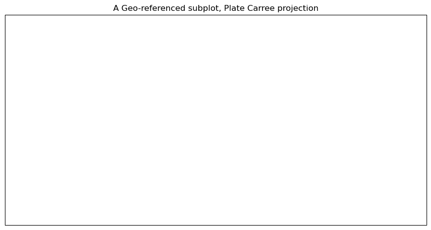
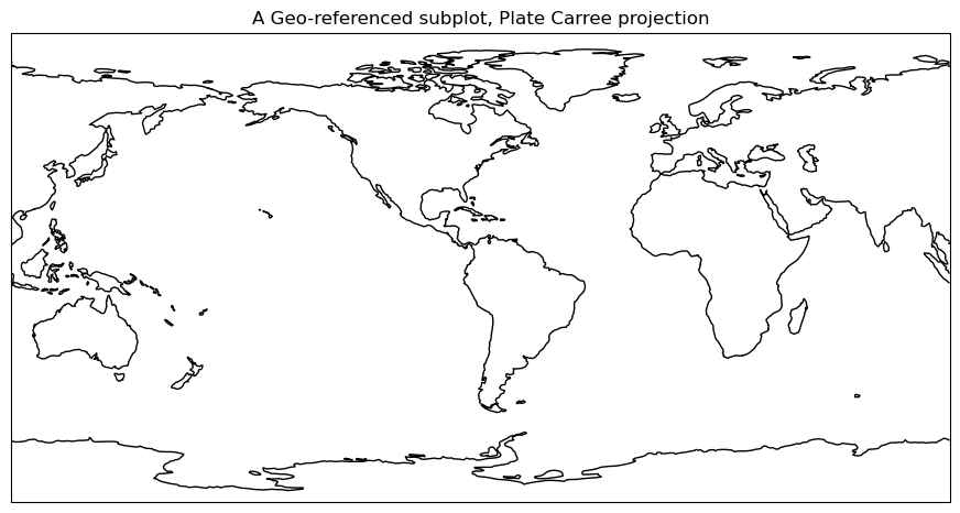
Although the figure seems empty, it has in fact been georeferenced, using one of Cartopy’s map projections that is provided by Cartopy’s crs (coordinate reference system) class. We can now add in cartographic features, in the form of shapefiles, to our subplot. One of them is coastlines, which is a callable GeoAxes method that can be plotted directly on our subplot.
ax.coastlines()
<cartopy.mpl.feature_artist.FeatureArtist at 0x7f3460198940>
Info
To get the figure to display again with the features that we’ve added since the original display, just type the name of the Figure object in its own cell.
fig
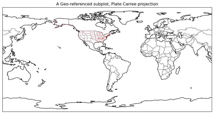
Add cartographic features to the map
Cartopy provides other cartographic features via its features class, which we’ve imported as cfeature. These are also shapefiles, downloaded on initial request from https://www.naturalearthdata.com/. Once downloaded, they “live” in your ~/.local/share/cartopy directory (note the ~ represents your home directory).
We add them to our subplot via the add_feature method. We can define attributes for them in a manner similar to Matplotlib’s plot method. A list of the various Natural Earth shapefiles appears in https://scitools.org.uk/cartopy/docs/latest/matplotlib/feature_interface.html .
ax.add_feature(cfeature.BORDERS, linewidth=0.5, edgecolor='black')
ax.add_feature(cfeature.STATES, linewidth=0.3, edgecolor='brown')
<cartopy.mpl.feature_artist.FeatureArtist at 0x7f3452fd12b0>
Once again, referencing the Figure object will re-render the figure in the notebook, now including the two features.
fig
Explore some of Cartopy’s map projections
Info
You can find a list of supported projections in Cartopy, with examples, at https://scitools.org.uk/cartopy/docs/latest/reference/crs.html
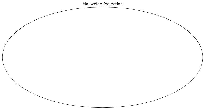
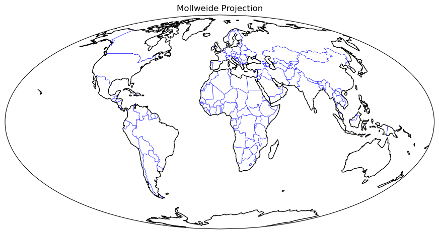
Mollweide Projection (often used with global satellite mosaics)
This time, we’ll define an object to store our projection definition. Any time we wish to use this particular projection later in the notebook, we can use the object name rather than repeating the same call to ccrs.
fig = plt.figure(figsize=(11, 8.5))
projMoll = ccrs.Mollweide(central_longitude=0)
ax = plt.subplot(1, 1, 1, projection=projMoll)
ax.set_title("Mollweide Projection")
Text(0.5, 1.0, 'Mollweide Projection')
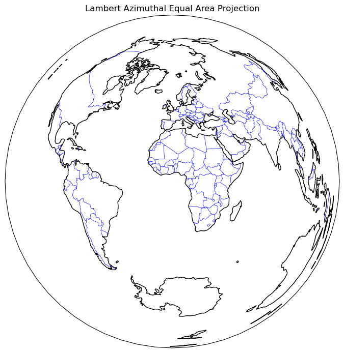
Lambert Azimuthal Equal Area Projection
fig = plt.figure(figsize=(11, 8.5))
projLae = ccrs.LambertAzimuthalEqualArea(central_longitude=0.0, central_latitude=0.0)
ax = plt.subplot(1, 1, 1, projection=projLae)
ax.set_title("Lambert Azimuthal Equal Area Projection")
ax.coastlines()
ax.add_feature(cfeature.BORDERS, linewidth=0.5, edgecolor='blue');
Create regional maps
Cartopy’s set_extent method
Now, let’s go back to PlateCarree, but let’s use Cartopy’s set_extent method to restrict the map coverage to a North American view. Let’s also choose a lower resolution for coastlines, just to illustrate how one can specify that. Plot lat/lon lines as well.
Reference for Natural Earth’s three resolutions (10m, 50m, 110m; higher is coarser): https://www.naturalearthdata.com/downloads/
projPC = ccrs.PlateCarree()
lonW = -140
lonE = -40
latS = 15
latN = 65
cLat = (latN + latS) / 2
cLon = (lonW + lonE) / 2
res = '110m'
fig = plt.figure(figsize=(11, 8.5))
ax = plt.subplot(1, 1, 1, projection=projPC)
ax.set_title('Plate Carree')
gl = ax.gridlines(
    draw_labels=True, linewidth=2, color='gray', alpha=0.5, linestyle='--'
)
ax.set_extent([lonW, lonE, latS, latN], crs=projPC)
ax.coastlines(resolution=res, color='black')
ax.add_feature(cfeature.STATES, linewidth=0.3, edgecolor='brown')
ax.add_feature(cfeature.BORDERS, linewidth=0.5, edgecolor='blue');
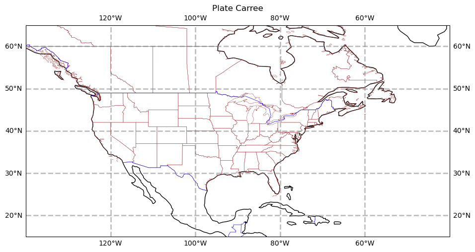
Info
Note the in the set_extent call, we specified PlateCarree. This ensures that the values we passed into set_extent will be transformed from degrees into the values appropriate for the projection we use for the map.
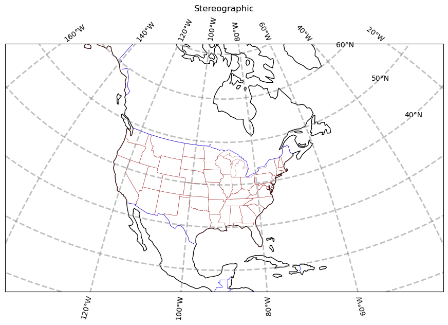
The PlateCarree projection exaggerates the spatial extent of regions closer to the poles. Let’s try a couple different projections.
projStr = ccrs.Stereographic(central_longitude=cLon, central_latitude=cLat)
fig = plt.figure(figsize=(11, 8.5))
ax = plt.subplot(1, 1, 1, projection=projStr)
ax.set_title('Stereographic')
gl = ax.gridlines(
    draw_labels=True, linewidth=2, color='gray', alpha=0.5, linestyle='--'
)
ax.set_extent([lonW, lonE, latS, latN], crs=projPC)
ax.coastlines(resolution=res, color='black')
ax.add_feature(cfeature.STATES, linewidth=0.3, edgecolor='brown')
ax.add_feature(cfeature.BORDERS, linewidth=0.5, edgecolor='blue');
projLcc = ccrs.LambertConformal(central_longitude=cLon, central_latitude=cLat)
fig = plt.figure(figsize=(11, 8.5))
ax = plt.subplot(1, 1, 1, projection=projLcc)
ax.set_title('Lambert Conformal')
gl = ax.gridlines(
    draw_labels=True, linewidth=2, color='gray', alpha=0.5, linestyle='--'
)
ax.set_extent([lonW, lonE, latS, latN], crs=projPC)
ax.coastlines(resolution='110m', color='black')
ax.add_feature(cfeature.STATES, linewidth=0.3, edgecolor='brown')
# End last line with a semicolon to suppress text output to the screen
ax.add_feature(cfeature.BORDERS, linewidth=0.5, edgecolor='blue');
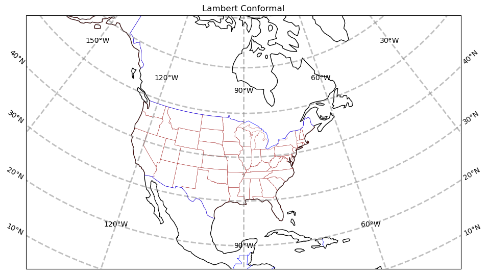
Info
Lat/lon labeling for projections other than Mercator and PlateCarree is a recent addition to Cartopy. As you can see, work still needs to be done to improve the placement of labels.
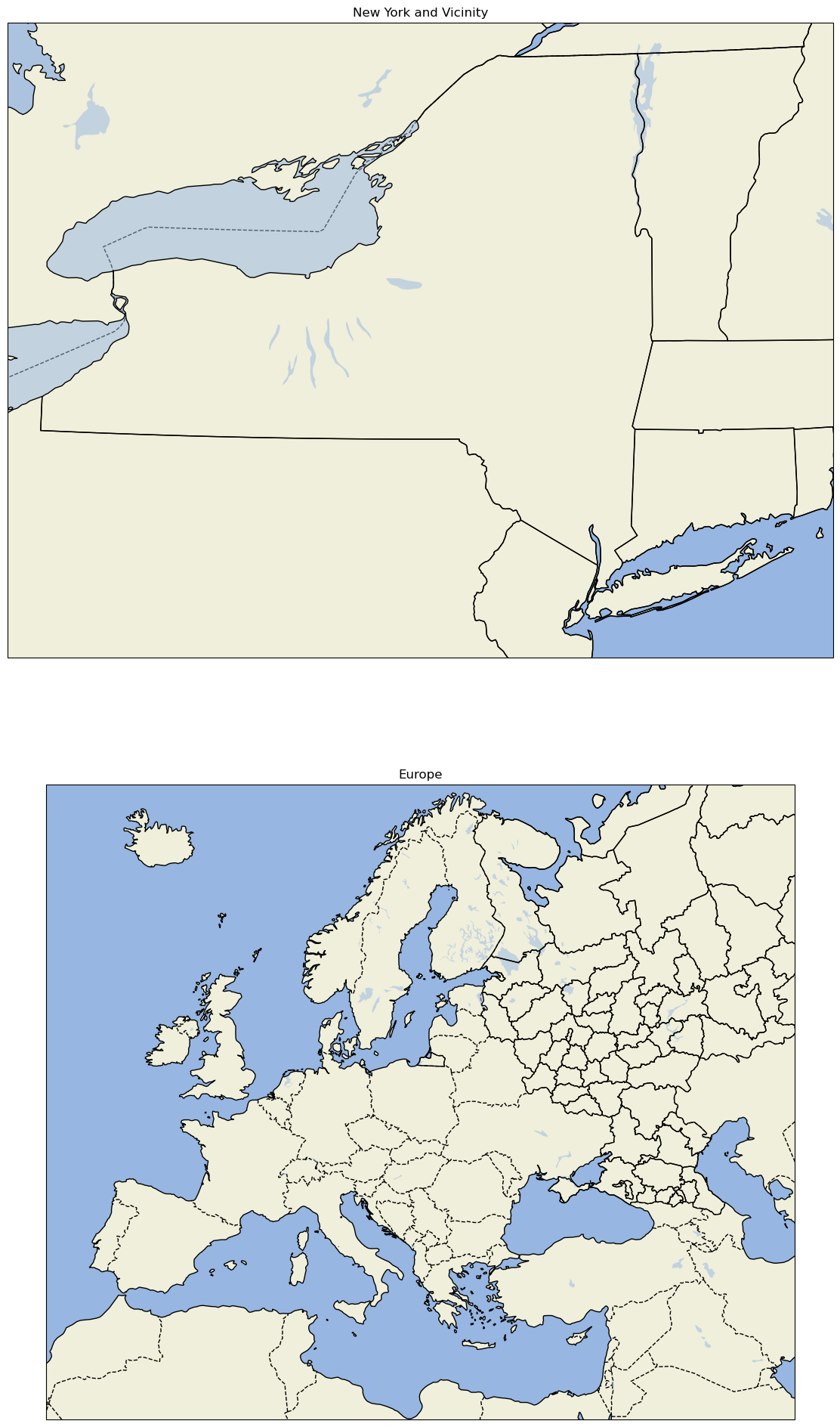
Create a regional map centered over New York State
Set the domain for defining the plot region. We will use this in the set_extent line below. Since these coordinates are expressed in degrees, they correspond to the PlateCarree projection.
Warning
Be patient: with a limited regional extent as specified here, the highest resolution (10m) shapefiles are used; as a result (as with any GeoAxes object that must be transformed from one coordinate system to another, a subject for a subsequent notebook), this will take longer to plot, particularly if you haven’t previously retrieved these features from the Natural Earth shapefile server.
latN = 45.2
latS = 40.2
lonW = -80.0
lonE = -71.5
cLat = (latN + latS) / 2
cLon = (lonW + lonE) / 2
projLccNY = ccrs.LambertConformal(central_longitude=cLon, central_latitude=cLat)
Add some pre-defined Features
Some pre-defined Features exist as cartopy.feature constants. The resolution of these pre-defined Features will depend on the areal extent of your map, which you specify via set_extent.
fig = plt.figure(figsize=(15, 10))
ax = plt.subplot(1, 1, 1, projection=projLccNY)
ax.set_extent([lonW, lonE, latS, latN], crs=projPC)
ax.set_facecolor(cfeature.COLORS['water'])
ax.add_feature(cfeature.LAND)
ax.add_feature(cfeature.COASTLINE)
ax.add_feature(cfeature.BORDERS, linestyle='--')
ax.add_feature(cfeature.LAKES, alpha=0.5)
ax.add_feature(cfeature.STATES)
ax.add_feature(cfeature.RIVERS)
ax.set_title('New York and Vicinity');
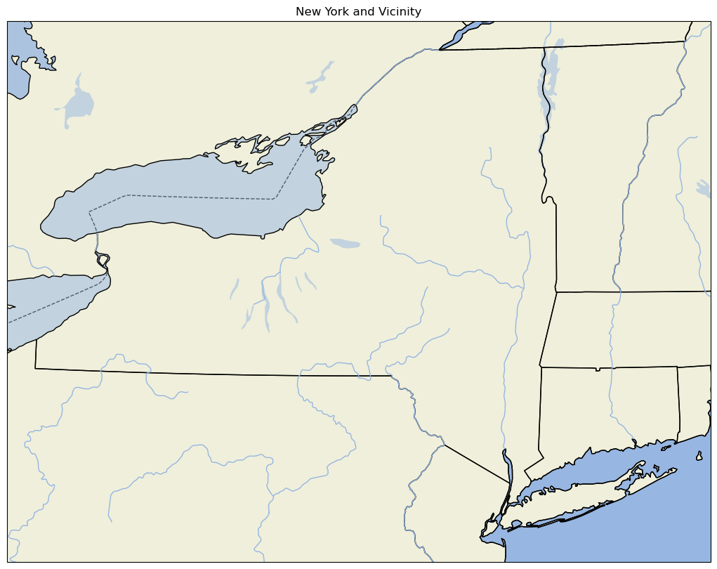
Note:
For high-resolution Natural Earth shapefiles such as this, while we could add Cartopy’s OCEAN feature, it currently takes much longer to render on the plot (try it yourself to see!). Instead, we take the strategy of first setting the facecolor of the entire Axes to match that of water bodies in Cartopy. When we then layer on the LAND feature, pixels that are not part of the LAND shapefile remain in the water facecolor, which is the same color as the OCEAN .
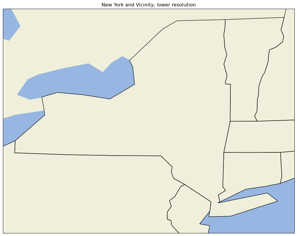
Use lower resolution shapefiles from Natural Earth
Let’s create a new map, but this time use lower-resolution shapefiles from Natural Earth, and also eliminate plotting the country borders.
Notice this is a bit more involved. First we create objects for our lower-resolution shapefiles via the NaturalEarthFeature method from Cartopy’s feature class, and then we add them to the map with add_feature.
fig = plt.figure(figsize=(15, 10))
ax = plt.subplot(1, 1, 1, projection=projLccNY)
ax.set_extent((lonW, lonE, latS, latN), crs=projPC)

# The features with names such as cfeature.LAND, cfeature.OCEAN, are higher-resolution (10m)
# shapefiles from the Naturalearth repository.  Lower resolution shapefiles (50m, 110m) can be
# used by using the cfeature.NaturalEarthFeature method as illustrated below.

resolution = '110m'

land_mask = cfeature.NaturalEarthFeature(
    'physical',
    'land',
    scale=resolution,
    edgecolor='face',
    facecolor=cfeature.COLORS['land'],
)
sea_mask = cfeature.NaturalEarthFeature(
    'physical',
    'ocean',
    scale=resolution,
    edgecolor='face',
    facecolor=cfeature.COLORS['water'],
)
lake_mask = cfeature.NaturalEarthFeature(
    'physical',
    'lakes',
    scale=resolution,
    edgecolor='face',
    facecolor=cfeature.COLORS['water'],
)
state_borders = cfeature.NaturalEarthFeature(
    category='cultural',
    name='admin_1_states_provinces_lakes',
    scale=resolution,
    facecolor='none',
)

ax.add_feature(land_mask)
ax.add_feature(sea_mask)
ax.add_feature(lake_mask)
ax.add_feature(state_borders, linestyle='solid', edgecolor='black')
ax.set_title('New York and Vicinity; lower resolution');
A figure with two different regional maps
Finally, let’s create a figure with two subplots. On one, we’ll repeat our hi-res NYS map; on the second, we’ll plot over a different part of the world.
# Create the figure object
fig = plt.figure(
    figsize=(30, 24)
)  # Notice we need a bigger "canvas" so these two maps will be of a decent size

# First subplot
ax = plt.subplot(2, 1, 1, projection=projLccNY)
ax.set_extent([lonW, lonE, latS, latN], crs=projPC)
ax.set_facecolor(cfeature.COLORS['water'])
ax.add_feature(cfeature.LAND)
ax.add_feature(cfeature.COASTLINE)
ax.add_feature(cfeature.BORDERS, linestyle='--')
ax.add_feature(cfeature.LAKES, alpha=0.5)
ax.add_feature(cfeature.STATES)
ax.set_title('New York and Vicinity')

# Set the domain for defining the second plot region.
latN = 70
latS = 30.2
lonW = -10
lonE = 50
cLat = (latN + latS) / 2
cLon = (lonW + lonE) / 2

projLccEur = ccrs.LambertConformal(central_longitude=cLon, central_latitude=cLat)

# Second subplot
ax2 = plt.subplot(2, 1, 2, projection=projLccEur)
ax2.set_extent([lonW, lonE, latS, latN], crs=projPC)
ax2.set_facecolor(cfeature.COLORS['water'])
ax2.add_feature(cfeature.LAND)
ax2.add_feature(cfeature.COASTLINE)
ax2.add_feature(cfeature.BORDERS, linestyle='--')
ax2.add_feature(cfeature.LAKES, alpha=0.5)
ax2.add_feature(cfeature.STATES)
ax2.set_title('Europe');
An example of plotting data
First, we’ll create a lat-lon grid and define some data on it.
lon, lat = np.mgrid[-180:181, -90:91]
data = 2 * np.sin(3 * np.deg2rad(lon)) + 3 * np.cos(4 * np.deg2rad(lat))
plt.contourf(lon, lat, data)
plt.colorbar();
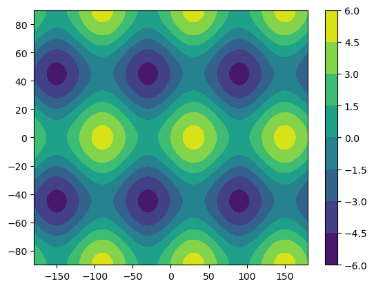
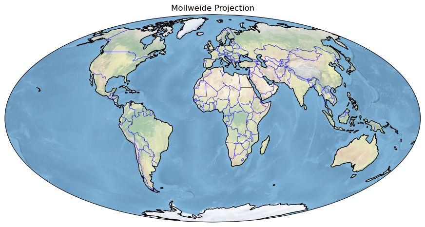
Plotting data on a Cartesian grid is equivalent to plotting data in the Plate Carree projection, where meridians and parallels are all straight lines with constant spacing. As a result of this simplicity, the global datasets we use often begin in the Plate Carree projection.
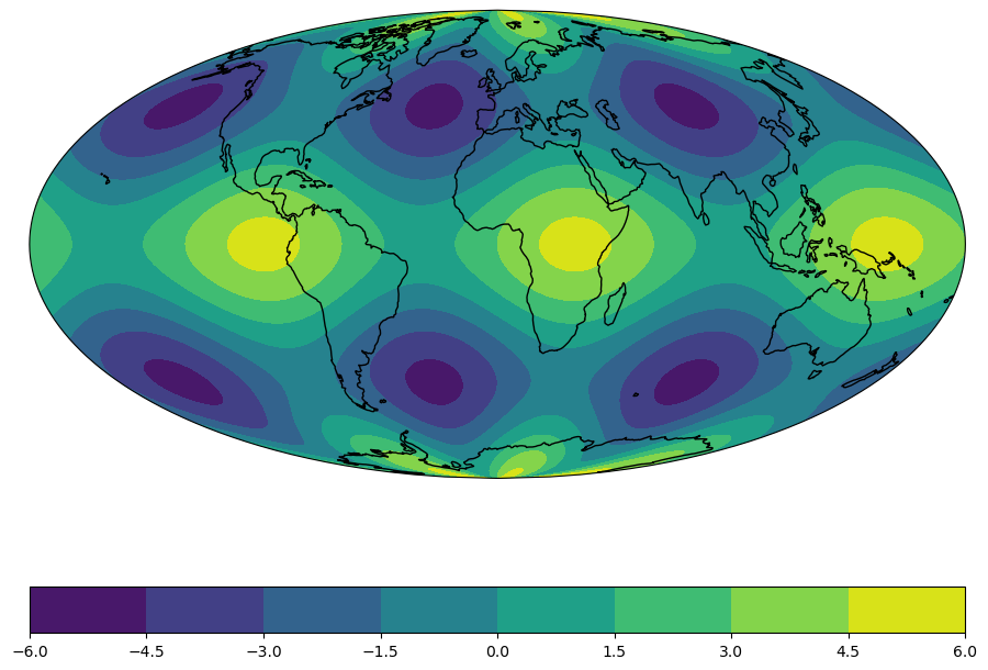
Once we create our map again, we can plot this data as a contour map. We also need to specify the projection we are transforming from (i.e. the projection our data is currently in) using the transform argument. Let’s plot our data in the Mollweide projection to see how shapes change under a transformation.
fig = plt.figure(figsize=(11, 8.5))
ax = plt.subplot(1, 1, 1, projection=projMoll)
ax.coastlines()
dataplot = ax.contourf(lon, lat, data, transform=ccrs.PlateCarree())
plt.colorbar(dataplot, orientation='horizontal');
Summary
Cartopy allows for georeferencing Matplotlib
axesobjects.Cartopy’s
crsclass supports a variety of map projections.Cartopy’s
featureclass allows for a variety of cartographic features to be overlaid on the figure.